10 decoration myths to stop believing now
2014.08.19

MYTH: THROW PILLOWS MUST APPEAR IN ODD NUMBERS ONLY
REALITY: It's more about what you feel works in the room. Here, in a Long Island home, designer Robert Stilin alternates two pairs of pillows in a similar color scheme for a look that's perfectly serene and symmetrical.
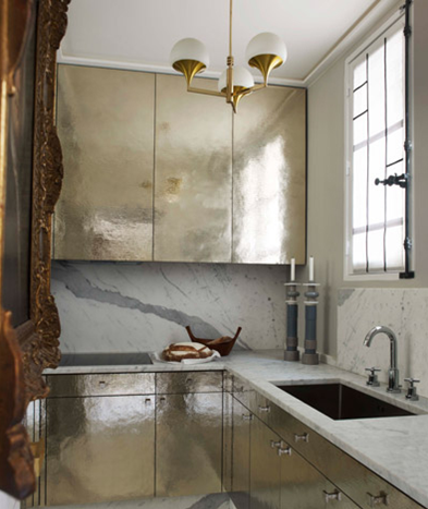
MYTH: TRENDS SHOULD BE INCORPORATED ONLY IN THE FORM OF SMALL, REPLACEABLE ACCESSORIES
REALITY: If a trend—say, metallics—speaks to you, you should feel full license to use it with abandon. Here, Jean-Louis Deniot's hammered silver kitchen cabinets show that going big on a trend you love can end up being the most show-stopping part of a home.
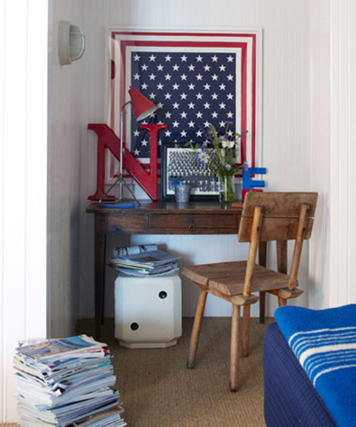
MYTH: COLLECTIONS ARE ONLY MEANT TO BE DECORATIVE
REALITY: A collection can be something as simple, beloved, and downright useful as a stack of magazines, as seen here in Eric Hughes and Nathan Turner's Malibu apartment.
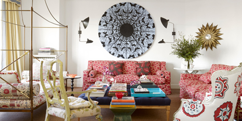
MYTH: CHOOSE ONE PATTERN TO BE THE STAR OF THE ROOM
REALITY: Through artful pairing you can feature two, three—even five!—fabulous patterns as long as you keep the color scheme similar, and get creative with scale.
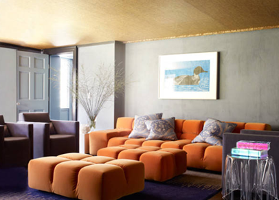
MYTH: YOUR CEILINGS MUST BE WHITE
REALITY: A dramatic color can actually draw the eye upward, plus it gives you an extra surface to make a major impression, as Richard Mishaan illustrates in a Westchester home.
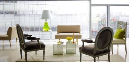
MYTH: ALL 4 CHAIR LEGS MUST BE ON (OR OFF) THE RUG
REALITY: It's more important that the space can morph and adapt to however guests configure themselves. In Michael Leva's Manhattan apartment, a flexible seating arrangement is constantly in flux to make room for everything from cocktail to dance parties.
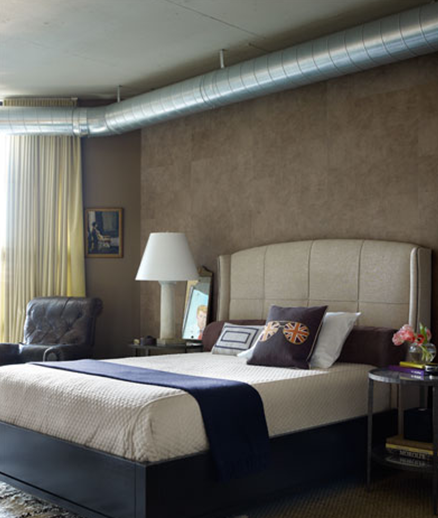
MYTH: ALL "UGLY" ARCHITECTURE MUST BE HIDDEN
REALITY: Even something like exposed ductwork, as seen here in a D.C. apartment decorated by Nestor Santa Cruz, can be embraced for what it is. "It gives a rhythm and movement that flows through the rooms," says Santa Cruz. Something to consider before taking on a massive cover-up process.
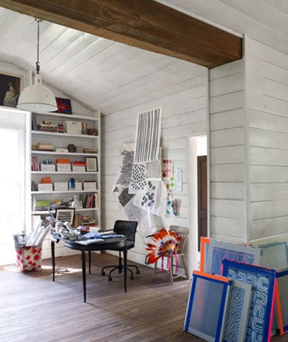
MYTH: ALL ARTWORK MUST BE AT EYE LEVEL
REALITY: Art can live wherever it feels at home—to your eye, at least. In Susan Hable Smith's Georgia home, a piece tucked up at the top corner of the room offers a moment of surprise beauty, while silk screens and drawings add pizzazz even from the floor.
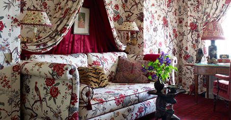
MYTH: ONCE IS ENOUGH, WHEN IT COMES TO A BUSY PATTERN
REALITY: If you truly love a pattern, why limit it to only one surface? In Alex Papachristidis's Manhattan apartment, the same cotton fabric covers the walls, sofa, canopy, and curtains...and still looks fresh and modern thanks to the artfully-chosen prints that balance the entire room.
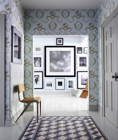
MYTH: THE MOST EXPENSIVE PIECE IN A ROOM SHOULD GET PRIDE OF PLACE
REALITY: It's the piece with the most character, not highest price tag, that deserves the spotlight. For example, this chair, in William Abranowicz's entry hall, was found in the dumpster!
Source: Elle Deco


 Visitor Registration
 Booth Application