Sweet Retreats: The Latest Looks for the Bath
2015.01.09
You asked for it; you got it: Here’s how designers are incorporating the latest looks into smaller master-bath designs
Recently Houzz contributor Natasha Saroca gave us the lowdown on bathroom trends expected to be big in 2015, and the Comments section went wild. Saroca showed us examples that cranked the style dial up to 11. These were big, exciting spaces that illustrated the trends at a professional-design-show level and offered plenty of inspiration.
Houzzers were eager to see more — and especially examples of smaller-scale spaces. Houzz user rslicker summed it up with this request: “How about it, Houzz … can we expect 14 designs of small, yet stylish, low-maintenance master en suites?”
Sure, you got it, rslicker. This is going to be fun! Here are Saroca’s 2015 predictions applied to smaller but still stylish bathrooms.

1. Feature floor tiles. Concrete floor tiles in a graphic geometric pattern work well in this minimalist contemporary bathroom. The vanity also fits trend No. 10, sustainable style, as it was crafted from a recycled cabinet.
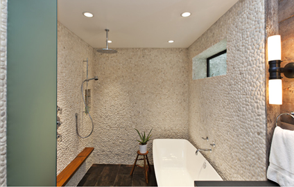
2. Natural beauty. The river stone tile in this bathroom adds a beautiful natural texture, as does the teak shelf. After going through several layout options, designer Mary Jo Fiorella decided, “It’s OK for the tub to get wet.” This layout allowed for a larger shower space in a relatively modest-size bathroom.
This room also incorporates trend No. 5, clever water control. The couple who lives here has young children, and the second handheld faucet makes giving them a shower a breeze.
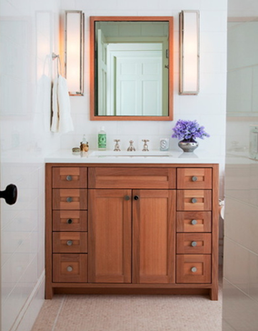
Another way to go natural is by staining the wood on the vanity rather than painting it. Here the homeowners can enjoy the beautiful grain on the oak.
3. Plant life. Saroca showed us just about the most fabulous vertical garden I’ve ever seen. The plant-life trend also references “cascading creepers.” For a low-maintenance, inexpensive alternative, a rosemary topiary; an orchid; a big, fat fern on a stand; or wall vases like the ones seen here can bring the green into your room with ease.

4. The master suite retreat. Saroca mentioned that bedroom suites more open to the bath were gaining traction — whether completely open or separated by sliding doors. She showed us one in which most of the bathroom was wide open to the bedroom. And the crowd in the Comments section gasped at the thought.
But if you spend money on a freestanding bathtub or beautiful wallpaper, you may want to enjoy the view. A sliding door like this one lets a small bedroom open up to the view of a claw-foot tub and a stunning turquoise beaded chandelier, and lets the owner enjoy the light reflected on the mirror. Likewise, the view of the bedroom can be enjoyed from the tub.
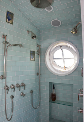
5. Clever water control. You know that phrase, “Save water — shower together”? It usually means one person is left cold and shivering outside the showerhead’s stream. A range of options, including dual showerheads, lets you enjoy togetherness while still being efficient about getting clean. And speaking of efficiency, I love the control of a handheld shower. It means you can take what my family refers to as “a Navy shower” — you turn the water off or down to a trickle when sudsing up your head with shampoo, waiting for the conditioner to set in or shaving your legs so as not to waste water.
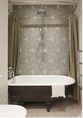
6. Freestanding bathtubs. I know it seems like you need a large bathroom to incorporate a freestanding bathtub and a shower, but you can combine them. I have this setup myself with a vintage claw-foot tub. Rigging it up with a shower curtain ring around the top is not tough and really does prevent the water from splashing out. The one piece of safety advice I have is to remember that when you step out of a claw-foot tub, the floor is farther away than you think. Be careful not to stumble, and be sure to let any guests know before they use it.
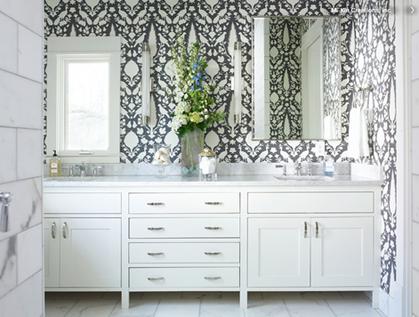
7.Custom vanities. A long custom vanity spans the wall of this bathroom, making the space feel much bigger than it is. The fact that it sits atop feet gives it a furniture look that also lends a more spacious feel. Four drawers offer enough room for everyone in the family to store their toiletries, while the cabinets have room for towels and cleaning supplies.
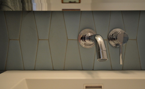
8.Geometric tiles. These stunning tiles create a showstopping backsplash. Using just a band between the top of a sink and the bottom of a mirror means you can splurge on a fancy tile without breaking the bank, because you’ll need only a few square feet.
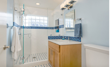
9.Bigger showers. You may decide to replace a tub-shower combo with a larger shower stall. This bathroom is only 40 square feet, and the homeowner and her 9-year-old daughter never used the bathtub that came with the house. They ditched the tub in favor of a spacious stall. Another change that will make your existing stall feel less claustrophobic is using clear glass, as seen here. Creating an open view is an easy upgrade that costs a few hundred dollars. If resale is not a concern in the next few years and you don’t need a bathtub, consider opting for a big shower instead of a tub-shower combo.
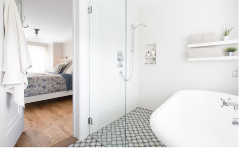
This bathroom makes the most of its square footage by combining the aforementioned freestanding bathtub with a bigger shower stall in a smart, space-saving way. Making the two open to each other allowed for a bigger shower area, while a partial glass wall keeps water splashes contained within this section.
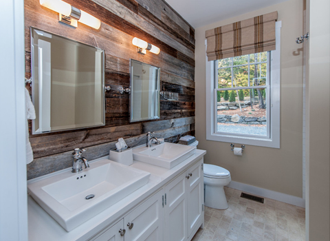
10. Sustainable style. There are countless ways to be energy efficient and water conscious in the bathroom. Some of the less visible ways are via systems and products — like low-flow toilets and shower heads, tankless water heaters, greywater systems, LEDs or compact fluorescent bulbs, and ecofriendly TP — and via habits, like taking Navy showers and even “being mellow about a little yellow.”
When it comes to energy-efficient style, there are beautiful-looking products as well, including VOC-free paint, recycled glass tiles, salvaged furniture and fixtures, and reclaimed boards for walls.
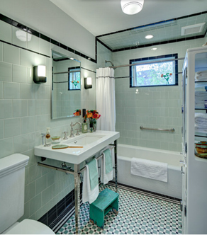
11. Bathrooms that reflect the rest of the home. If you live in an older home, chances are that your bathroom has gone through an unfortunate renovation at some point. The owners of this New Jersey bathroom had the 1970s brown and yellow claustrophobic original version ripped out of their 1912 house and returned it to a style that suited the rest of the home’s vintage. Handmade tiles in historic patterns and colors, and vintage apothecary style, brought the family bath back to its architectural roots.
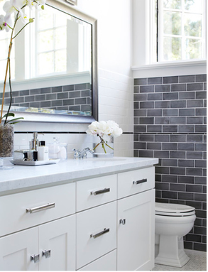
12. Gray tones. It seems gray is here to stay, and it’s not all about “greige” anymore. Tones picked up from natural stone, like Carrara marble or slate, are a good place to start. The variation in these 3-inch by 6-inch subway tiles adds depth and visual interest to this sophisticated bathroom. The tiles are a strong complement to the Carrara marble mosaic tile floor.
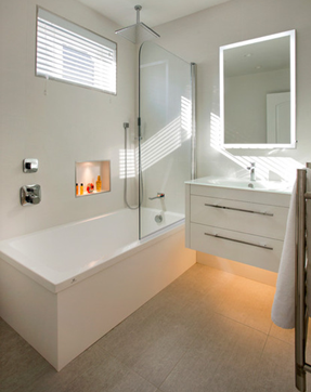
13. Engaging lighting. In a master bath you need functional bright lighting for getting ready in the morning, but there are mood lighting considerations as well. Decide which lights you’d like on a dimmer for relaxing soaks in the tub or those late-night trips to the loo.
Lighting built into the mirror, beneath the wall-mounted vanity and even in the niche adds futuristic touches to this minimalist bathroom.
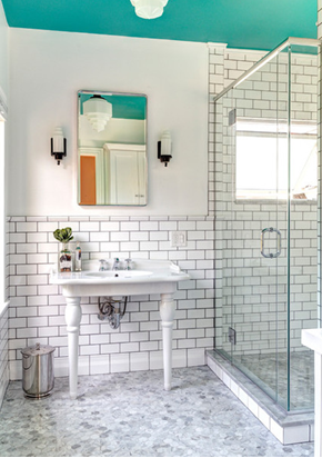
14. Grout as a design feature. The grout between this bathroom wall’s subway tiles ties it to the gray and white palette of the marble floor.
Have you incorporated any of these popular looks into your bathroom design? If so, please share with us in the Comments section.
Source: houzz.com


 Visitor Registration
 Booth Application