Speed-Dial Color Selection to Get the Best Result
2015.01.14
Color selections are best made quickly. Landscape painters know this because they learn that long deliberations only make colors appear the same. Science tells us that our visual receptors, rods and cones respond immediately to light waves reflected off surfaces, and the resulting signals travel swiftly to the brain. So why then do we hem and haw when trying to choose a kitchen floor or wall paint that could be just about any color that we can imagine? As an architectural color designer who is also a landscape painter, I guide clients to look at their homes with fresh eyes and log their first responses to get the color and material choices they really want.
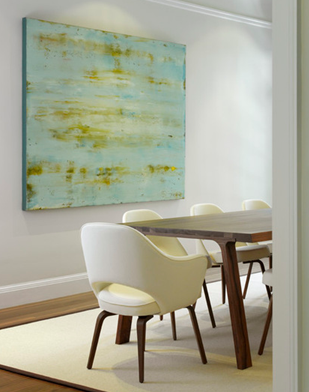
Lessons from landscape painting. The human brain does its best color work intuitively. When our minds are relaxed, our sensory awareness is fresh. In the first 20 seconds of seeing a color, we can identify it accurately. Spending time reasoning about what we think we see only causes confusion — which to our rods and cones is the visual equivalent of gray.
First impressions are therefore best when looking at a color and making a judgment about its light qualities. Artists learn on location to use the brain’s first, and best, analysis of light conditions. You can learn this habit of being sensitive to color nuances and bring light into your home.
But before ziplining to any color conclusions, you’ll want to use a little site analysis to guide your path.
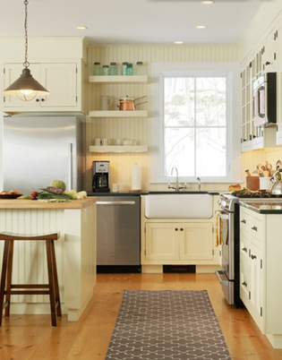
Consider natural light. Look at the natural light that illuminates the rooms for which you are devising a color plan. Identify the orientation and the amount of light available during the time of day each space will be used.
A kitchen that receives eastern light will have a soft, sunny glow at breakfast but will need some help to be a positive family gathering spot in the late afternoon when dinner is being prepared. A light wall color that has a yellow or an orange tinge can give the room a sunlit glow at the end of the day.
Acknowledging the pluses and minuses of the room’s light conditions will help you narrow down your color choices.
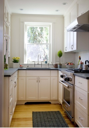
Look at the materials in the room. How light bounces off walls, countertops and floors is another condition to note before making color selections.
If a black honed-granite countertop is draining light from your kitchen, the walls and floor will need to be pressed into service to amplify the sunlight. You might choose a warm yellow floor to step in for the sunlight being extracted from the room. Light-colored cabinets also can send natural light where you need it.
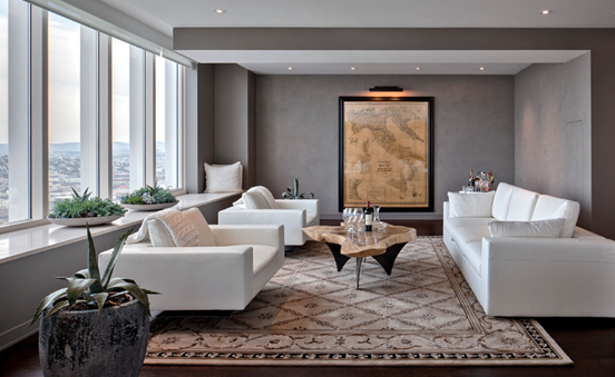
Is it warm in here? Knowing how to interpret your family’s need for heat and light is a color basic for any room. Is there enough warmth in a north room to study in the afternoon when homework is happening? Does the southern-exposed living room of your summer house receive too much sunlight to offer a refuge from the beach during the day? Is there foliage outside the windows that will block the light when you plan to use the room?
Visual color cues can make us feel warm or cold. You can use color to adjust the balance. Warm colors, such as yellow, orange and red, mimic sunlight and fire, and raise our blood pressure and body temperature. Cool colors, such as blue-gray, cool greens, white and black remind us of stone, snow, ice and water.
This living room gets plenty of warm, south-facing light with zero tree shade. Cooling the walls with gray and white has softened the sunlight, diminishing the glare and the oversupply of high energy, to encourage quiet conversation and reading.
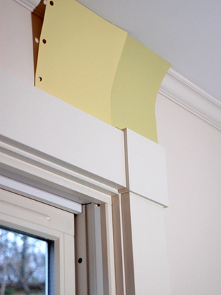
View your colors in the space. Once you have established the requirements for natural light and its availability in your rooms, gather samples of colors you think you might like for each room. You can order these online from many paint and flooring companies.
Be sure the samples are large (at least 6 by 9 inches), and multiples are a must. You can tape paint samples on the wall with painter’s tape affixed to the back; place flooring samples at the baseboard’s edge.
Never try to make a decision about any material for your home without first sampling it onsite. Color is not static; it changes as it interacts with the available light and other colors in the room.
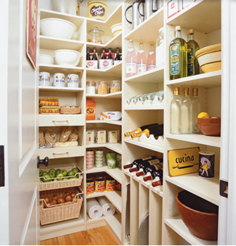
What color are you craving? I tell clients and students searching for color ideas to try a trick that many landscape painters use to make swift judgments about color.
Think about the “taste” you are trying to achieve, as you might while deciding what you want to snack on. Are you craving something salty or sweet or perhaps a little tart? By trying to interpret a color through a sense other than vision, your perceptions are heightened naturally. This is called synesthesia. Try tasting your way to ideas about color — and order more samples than you could possibly use.
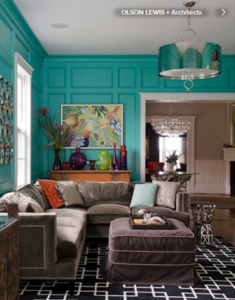
Work the angles. Though it is your frontal vision that “sees” color, the ability to look at color choices obliquely is a trick of the trade. Move around the room as you assess your samples and pick one or two that you think work. The choices will be obvious if you do not stand in one place, rigidly questioning your ability to decide what is best.
This is where speed helps you get the result you want. You’ve done the work of light assessment required to make good color choices. Now let yourself use your intuitive knowledge to create the home that you and your family desire.
Edit out the samples that do not satisfy and then choose from the remaining two. There is no one right answer. This part of the color process is fun and can be done in a snap. Let yourself tap into your innate understanding of what makes a habitat satisfying. From your lifetime of experience, the information you need to make a choice of color that fits your requirements is preprogrammed, just ready to be put into play.
Source: houzz.com


 Visitor Registration
 Booth Application